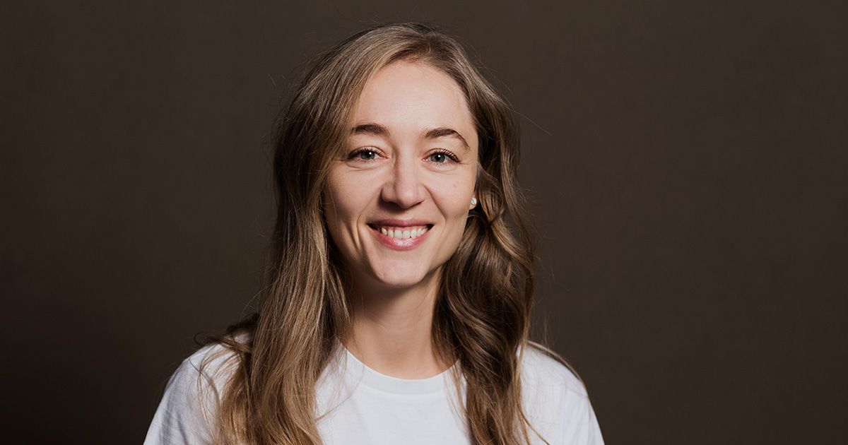
It all started about a year ago. It was pretty obvious for us - the Telerik Academy website had a little too much mileage since its last major redesign. Here's how and why we decided to redesign our website - an interview with Polya Vassileva, Telerik Academy's Creative Director, about the challenges and the lessons learned.
 "A visual refresh was definitely long due for us. In addition, we realized we had developed our Alpha and Upskill programs so much in the last years that the website didn't fully encompass and communicate all the benefits and value they bring to the students,"
 elaborated Polya Vassileva, our Creative Director.
Polya is the creative force behind our visual presence but also so much more.
"I get to work on a little bit of everything design-related - crafting marketing materials, enhancing the user experience and interface of our internal and external systems, and the design of the website. I also help train future UX/UI designers as part of our Upskill program for design."
And just like Polya said, the redesign of our website wasn't only about a visual update - the new design had to include more content, information about the programs, timelines, and illustrations while remaining easy to consume and use.
"This called for longer pages with better organization and navigation - on each individual page and through the website as a whole," explained Polya.
With her help, we'll give you a unique insight into how we managed to do all of this - the workflow, tools, validating our ideas, and the most significant challenges during the redesign process.
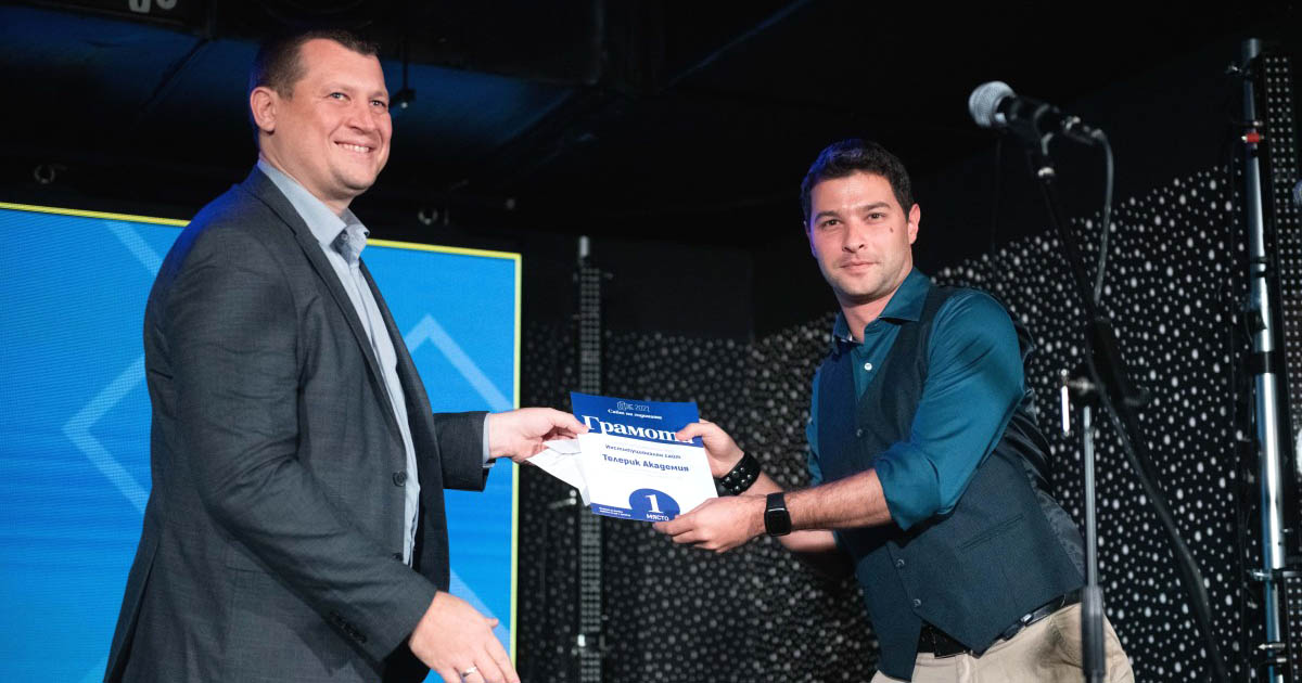
A redesign that
went on winning two Website of the Year Awards (jury and popular vote) in the Institutional website category.

How did you approach the task? What was the brainstorming process like?
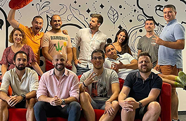
We got together with colleagues – our instructional design lead, a technical trainer, marketing manager, project manager, myself and even the CEO. We discussed what we wanted to improve, throwing a bunch of ideas on the table.
We looked at competitors on the global market and pinpointed what we liked in their web presence and what we didn't. We analyzed the feedback and questions we'd gotten over time from candidates and alumni. Then we discussed what's realistic and technically possible versus priorities and desired timelines and agreed on short- and long-term goals.
After the kickoff meetings, we started collaborating in Miro on the new structure and navigation of the website. We recognized we had some navigation issues, but we wanted to examine them with users, so we organized moderated user tests in the form of Zoom interviews. The findings were fascinating – some were expected, others were very helpful to identify more opportunities for improvement.
Can you talk us a little bit through the workflow behind the new design?
I looked at many websites for inspiration and created an idea board of different elements, interactions and techniques I wanted to try out and possibly incorporate. I'm not calling it a moodboard because we already had an established visual brand. I didn't want to stray from it, but I wanted to evolve it with the new website.
The marketing team wrote the initial content with the help of the technical trainers – the people who teach our programs – and having that I created a low-fidelity interactive prototype so we could use it as a basis for discussion. It's constructive when stakeholders and content creators have something visual to look at to imagine how the information would be laid out and give the green light for one approach or another.
I also used that to discuss options for implementations with our front-end developer, so she could give us rough timelines and even begin work before the design was finalized, thus utilizing the time more efficiently.
How did you validate the need for redesign and then, respectively, the new design?
Apart from the initial user testing we did on the existing website, which was extremely helpful in identifying what we needed to change for certain, we did another round of the same type of interviews with the high-fidelity prototype once the design was ready.
We got some interesting feedback. Users caught some minor issues but also gave us lots of positive comments on the design.
What was the biggest takeaway for you from the user interviews?
We may think we know our users, how they think and what they need, but we can never be sure unless we ask them. Moreover, it's what they say and what they do that matters, so observation during the tests was also crucial.
Probably the biggest takeaway was for the Alpha program pages - we needed to present clearly from the start a recap of what the program is with the most important information about it.
What were the main challenges during the redesign process?
One challenge was finding the best way to communicate all the information about our programs in the best organized and most concise way. It was a difficult task because we do have a lot to offer!

Contextual sticky side menu to help navigate within the long pages
Another tricky part was that the program pages became too long, so we needed to offer users a way to navigate inside the pages and know where they are at all times. We introduced sticky side navigation for that purpose, which we believe was a good solution.
A challenge all designers face, and I was no exception, was deciding which visual ideas, colors and illustrations to incorporate and how to get unstuck from creative blocks. We wanted the design to be fresh, yet not foreign and utterly different from other pages on the website that weren't getting a redesign right now.

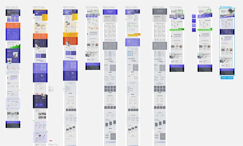
Numerous iterations of the prototype phase
The new website has more information, respectively more text. Was it hard to manage the balance between text and visual content?
The role of the visuals should be to guide the eye and supplement textual information, not drive away focus from it. As with every design, the web pages should have a visual rhythm that helps the user scan the content and browse through it without getting overwhelmed, with areas for the eye to rest and other areas to dive deeply.
Creating a balanced layout and composition is about creating a hierarchy based on prioritizing the most important content you want the user to see. It's always a process, and it doesn't happen fast, but it's one of the most important parts of a designer's job and one I enjoy immensely.
It's also what new designers struggle with most often, I have found while reviewing student projects in the
UX/UI Design Upskill program.
What kind of tools were involved in the process?
Figma for the prototyping, design and handoff. Adobe Photoshop and Illustrator for the visual content creation – photographs, icons, illustrations. Zoom video calls for the moderated user tests. Microsoft teams for internal team meetings. Аsana for project management. Miro for initial information architecture drafts, collaboration and whiteboard brainstorming sessions, although Figma launched Figiam since then. It's probably what we'll use in future projects. Microsoft Office 365 package for the written content and collaboration.
Sitefinity is our content management platform, and the front-end developer we worked with constructed everything in modules so that we could reuse and recreate almost anything with no coding skills later on.
How would you describe the new website?
I'd like to think it's easier to navigate, innovative, engaging, reflective of our brand and that it communicates the value Telerik Academy programs offer in the clearest and best possible way. We are not done yet, there are more pages in the works, and we'll continue redesigning and improving it, but we are thrilled with the result so far, and we hope our users are too.
Are you a designer who wants to master the best UX/UI principles in 3-months under the mentorship of Polya and other experienced professionals from companies such as HYPE, Progress, Gtmhub, Leanplum, OfficeRnD, Fontfabric, Oblik Studio, and Remix? Then apply to our
Upskill UX/UI design program!


